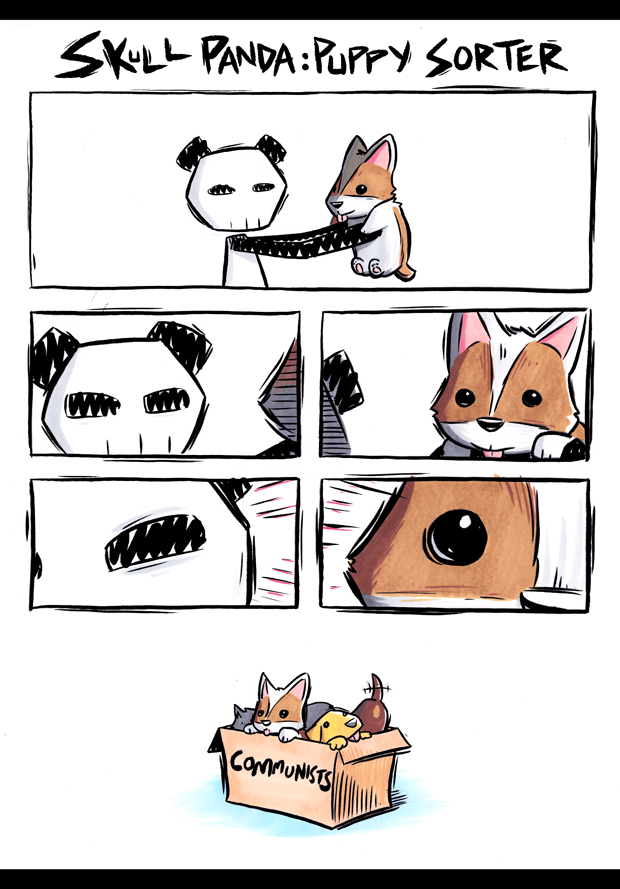
Puppy sorter
Skull Panda is either not very good at his job, or too good at his job.
See y'all on Friday, team!
-Sam Logan
Spin off
I'm going to let you in on a little secret, team. No one actually rejected any of these. Baker answers to no one.
See y'all on Wednesday!
-Sam Logan
Q & A: Photo Edition
Got a question you want answered? Just drop me an email with "Q & A" in the subject line!
"Do you still do Q&A's? How do you make your comics that have photo backgrounds work with having 2D characters look like they're truly interacting with the 3D environment (the water, the snow being walked in, etc.)?
I guess that was technically two questions!" -Agni
I'll bring Q&A back JUST FOR YOU, Agni!
For my photo comics, there are two main things I focus on to make the art and photos mesh:
The first one is lighting! The characters themselves are all still drawn in my normal cartoon style with black lines and flat colours... and I still shade them with a single flat tone. (Although I give it that shading a feathered edge instead of a hard one.)
But once the drawings are finished and placed into the panels, I also hit 'em with some simple lighting effects, basically treating each character drawing as though it is a big flat cardboard standee that I printed out and placed in the location. I tint the colour tones to skew towards the tones of the photo, and I apply some soft directional lighting -- for example, you'll notice in the first panel here that Sam is being lit from the right, and that even his black lineart is lightened by it. I think this helps make the cartoon elements blend in, while still keeping them cartoony and unrealistic.
The second thing I focus on is creating lots of excuses for the photo and cartoon elements to affect one another. For example, I like to depict the characters standing partly behind cut-out photo elements, like branches or railings or snowbanks, and then have those objects cast simple cartoon shadows onto the characters. Even though the shadows are not realistic, it helps sell the illusion that the cartoons are actually present and being affected by the objects around them.
Similarly, when the cartoons do things that would impact the photo elements, I try to keep those impacts photo-based rather than drawing them in. For example, when the characters are walking through the snow, I didn't draw in cartoon footprints-- I just took some actual photos of footprints and other snow impressions and photoshopped them into the right spots. Similarly, the snow that sticks to Sam's pants is also pulled from a photo, rather than being hand-drawn.
The trickiest examples of this in this story were actually the bursts of snow spray when Baker chows down in Wednesday's comic. If I was a talented photorealistic artist, I could probably draw that effect from scratch. But I'm not that kind of artist! So instead, the snow bursts are actually mostly made out of elements I pulled from (public domain) snowboarding photos, with a little extra spray drawn in in photoshop.
Anyway, that's the gist of the process! This kind of thing is definitely a little outside my wheelhouse, and I am sure there are many ways I could have done it better or more convincingly if I was more experienced at photo editing. But it's good to get out of your comfort zone sometimes!
That's all for today, team. See you on Monday!
-Sam Logan
I also try to come up with excuses to have the characters standing partly behind photo elements, like branches or railings, and then have those objects cast simple cartoon shadows onto the characters. It's a very simple effect, but I think it works... even when the shadows are not reaaaally accurate to the lighting of the scene.