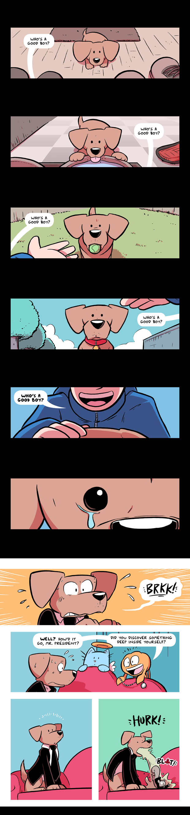
He's a Good Boy
Whew! I know a lot of you were worried about Prime Minister Squirrel.
We return on Friday with a new comic, and a brand new Friday Q and A column! If you've got a question you'd like me to answer, just pop it in an email with "Q and A" in the subject line. (Or tweet it at me.) See you then, team!
-Sam Logan
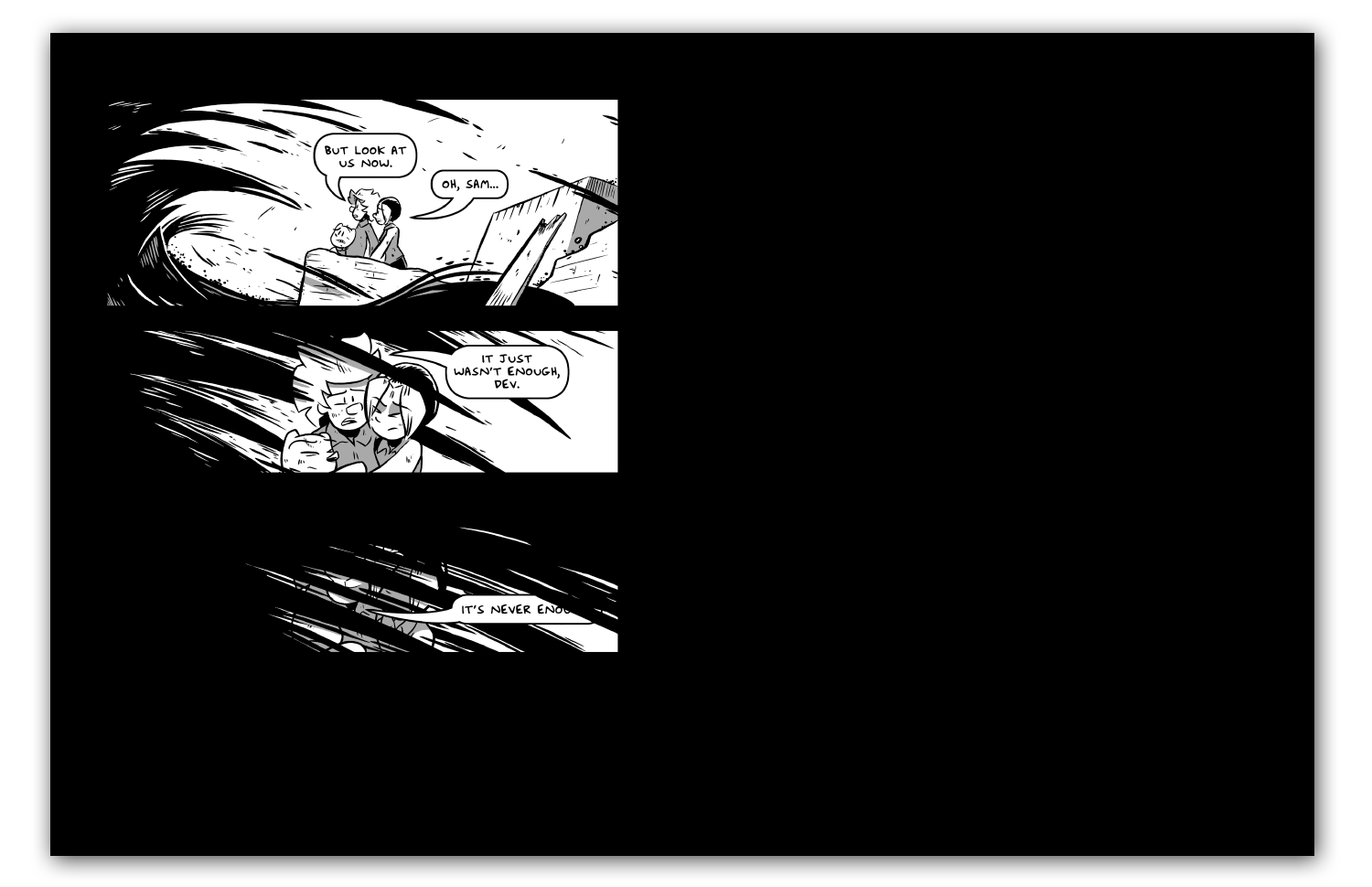
Remember
Today on very tall comics: a very tall comic!
Come back on Wednesday for the next installment, team. See you then!
-Sam Logan
Sam and Fuzzy Q & A: Double-Page Spead Edition
Got a question you want answered? Just drop me an email with "Q & A" in the subject line!
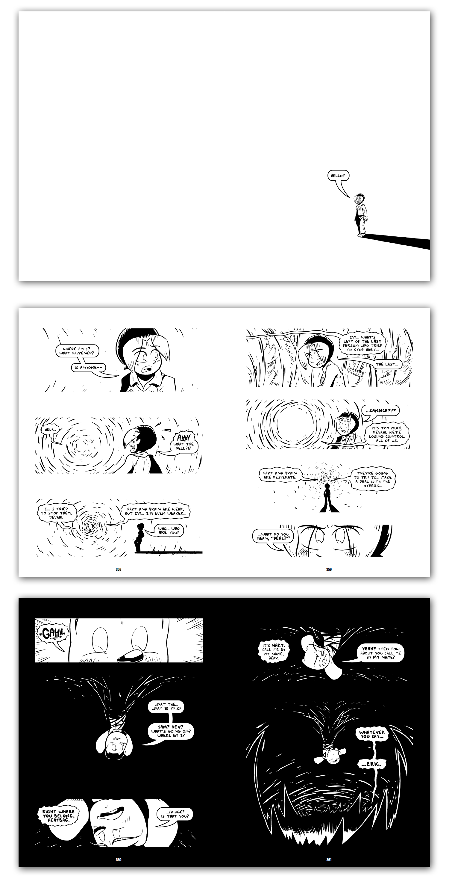
"I've been reading the last 2 books and really loving them. I know you talked a few times as you were wrapping up the series about how you were writing with the layout of the physical books in mind, and I'm curious how that process worked in practice. The pages where Fuzzy and Hazel first get into the Pit and are just standing in that empty black space are shockingly powerful to me, and I wonder if you had to work very hard to get the 2-page spreads to fit correctly, and if so, did you use any particular tricks to get everything to work right?" -Jason
Ooh boy! Thank you, Jason, for giving me an excuse to talk about this, because it's something I put a lot of thought into and care a lot about. It definitely took some careful planning! Let me dig in a bit, here.
On the website, the comic-viewing area is only one "page" wide. But in book form, the pages are printed side-by-side in groups of two. So, you always see two pages at a time. (Unless, of course, you like to tear them all out and make decorative collages.)
This change in layout isn't a huge deal for most Sam and Fuzzy comics. BUT... side-by-side pages had huge implications for the climactic chapters of the story, which often made use of big negative spaces of solid black or white for dramatic or visual effect. I wanted to make sure I used the double-page spread format of the book version to maximize those effects, rather than undercut them. So everything had to be written and drawn with them in mind.
The whole time I worked on those chapters, I kept careful track of which pages were "left" pages and which were "right" pages, and planned out how all my uses of large black and white spaces would work as double-page spreads. Then I made the versions for the website, which are redesigned for the one-page-wide format!
For example, I was careful to make sure this comic ended on a left-side page, so that effect of everything being swallowed by the tar could lead to a huge empty space on the right. I really wanted it to feel like everyone was getting wiped right out of existence, leaving nothing behind. This was something that I could really emphasize in double-page form.
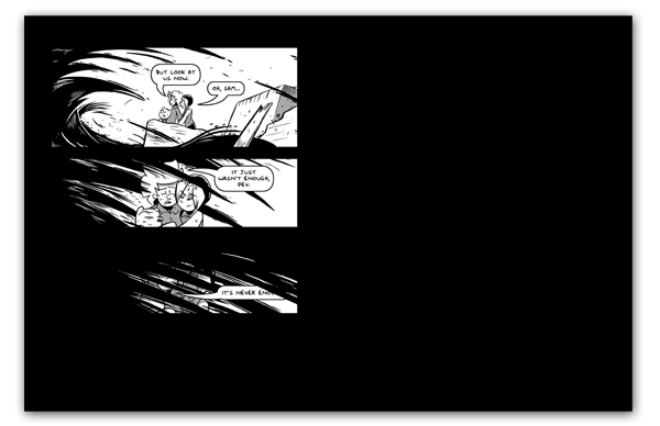
Another example is the white "Candice void" sequence from this comic. In print, it starts with a nearly empty double-page spread for visual effect. Then, the white sequence ends on a right page, to ensure that there isn't a spread that's "split" between black and white pages. (Such "split" spreads are reserved for later in the chapter, when Candice and Brain start interacting and fighting each other for control.)
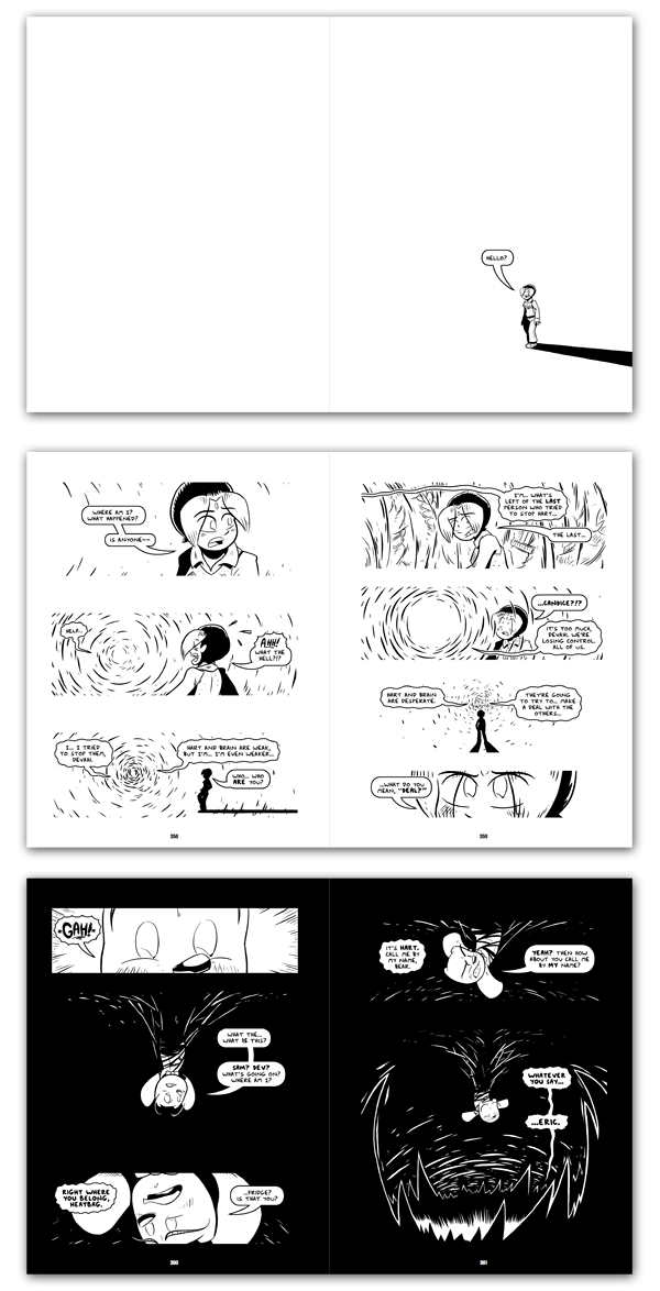
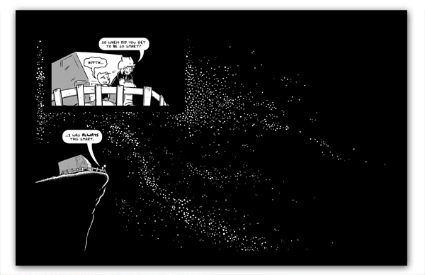
One other fun example is this comic -- the last comic with Sam and Fuzzy together! In the book, it's presented as an expanded double-page spread. I like it because it gives the scene a little more air. But the expansion also serves a more mechanical function... it ensures that the final page of the story (the shot revealing the title of Fuzzy's book) lands on a right page rather than a left one. If it landed on a left page, then I'd have to run something next to it on the right, which I did not want to do! I wanted that book title reveal to be the "final word" of the story, so to speak.
One last note... as you can see above, while most pages in the books are generally numbered, I sometimes removed the numbers on spreads where I didn't want them to mess up the empty feeling I wanted. I do what I want!
These kind of big negative space effects aren't anything new in comics. But they are ones that I felt would be particularly powerful in Sam and Fuzzy's stark, black-and-white art style. Sam and Fuzzy books are "full bleed"... that means the black borders of the comics extend all the way to the edges of the pages. Fully black pages really feel like the ink of the borders has closed in and swallowed everything up. And fully white pages, like the Candice void sequence, have a really startling empty feeling after hundreds and hundreds of black-heavy pages.
Anyway, thanks for giving me an excuse to dig into this here. I love books and book layout!
Speaking of books... we're still in the midst of mailing out the last of our orders to kickstarter backers and pre-order folks. But once we're done, we'll be making these last two books available in my regular online store. I'll let you know when they're ready!
That's all for today, friends. But come back on Monday for our next comic!
-Sam Logan